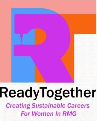
While living in Dhaka, Bangladesh, I focused initially on understanding and improving gender inequality in the garment factories. Ultimately I was able to have more of an impact in local design education, but all of my work came under the program I call Ready Together. I chose that name to reflect the partnership effort that is required for holistic, integrated change in the Readymade Garment sector, between industry and education, between factory owners and brands, between top management and factory workers, between the individual men and women who make up that workforce. I sought to reinforce that idea through color primarily – the blue R (representing the men) and the red T (representing the women) overlap to make a purple (symbolizing nobility, royalty) sewing machine, reflecting the integrity and higher value of teamwork. The warm pink right angle encompassing the letters is meant to suggest that pragmatic empathy and care are the building blocks in this process. I also liked that the result stands out among other sustainability-related logos, which of course tend to always be some shade of green or brown…Ready Together is focused on the human/social side of sustainability, rather than the environmental aspects, which are of course still relevant and important, just not a necessary part of the brand concept.